Randi
Nasatir-Cleven
RC
Case Study:
Fox Valley Food Pantry
Responsive Website, Desktop, Tablet & Mobile
Interested in volunteering or donating at the local food pantry? The Fox Valley Food Pantry responsive website allows users to quickly and easily sign up for a volunteer session, get volunteer job descriptions, read how their volunteer work impacts the community and ultimately feel like they are making a difference to their neighbors who are in need. The main user flow that is highlighted is the volunteer sign up process.

.png)

PROJECT OVERVIEW
The Problem:
Volunteers want a quick, uncomplicated and flexible way to register individually or as a group for a volunteer opportunity that accommodates their busy schedule and know how it impacts their community.
The Goal:
Design a responsive website that allows a quick, easy and flexible way for users to sign up to volunteer, based on the users own needs, that works with their busy lives and schedule and ultimately allowing them to feel like they are making an impact on society.
The Product:
The Fox Valley Food Pantry Website is a responsive website for users to easily and quickly sign up to volunteer and make donations. The food pantry collects and distributes food to people who are unable to afford food in the Fox Valley area in Illinois and is run 100% by volunteers. The website allows volunteers to effortlessly evaluate, select and sign up for a volunteer job session in minutes. The website targets individuals, families and groups who are busy with work or families but still want to give back to their communities by volunteering.
Project Duration:
November 2021 to January 2022
My Role:
UX Designer designing a food pantry volunteer website from conception to delivery. Including UX research, product design, visual design and interaction design.
Responsibilities:
Conducting interviews, creating persona’s, conducting competitive audit, constructing paper and digital wireframing, building low and high-fidelity prototyping, conducting usability studies, analyzing affinity diagrams, composing actionable insights, accounting for accessibility, and iterating on designs.
UNDERSTANDING THE USER
I conducted initial interviews and empathy maps to understand the user better. From this research, the main user group I identified are concerned people with busy lives who want a quick, simple way to sign up to volunteer without a lot of complication. After completing a in-depth competitive audit, I also identified several gaps in other sites that I could improve upon on my website. I honed in on the fact that users want lots of volunteer opportunities, they want job descriptions so they know what they're doing, easy ways to change and cancel their jobs and they want to see the impact of their work.
User Pain Points
1. Frustrated
Frustrated that websites are so complicated, take too long to fill out and are inflexible for busy schedules.
2. Annoyed
Annoyed not knowing what the job is that they are signing up for.
3. Unappreciated
Unappreciated because they have no idea if what they are doing is making an impact or not.
4. Upset
Upset that canceling a job makes them feel bad and guilty and wants to not feel that way.
Persona and Problem Statement
Darnell is a busy professional, strong family man and someone who wants to give back to his community who needs a way to register he and his family for a volunteer opportunity that is quick, uncomplicated and flexible enough to accommodate their busy schedule and know how it impacts their community because he wants he and his family to feel like they are making a difference and to maintain their enthusiasm about helping others less fortunate than themselves.
.png)
User Journey Map
The user journey map revealed that users need lots of links, images, and alerts but most of all users need to be able to customize their task lists so that their list is meaningful to them.
.png)
STARTING THE DESIGN
Site Map
I noticed from my competitive audit that each of their sites had a volunteer and a donate section so I knew I wanted those. Then it was just a matter of what else the user needs access to when they land on the homepage. Their account and about us makes sense for the home page headings. Within each of the headings are the different processes that can take place. Volunteer has of course the registration process and donate has money donations and food donations underneath it.
.png)
Paper Wireframes
Wireframes
Goal: To create a homepage for the Fox Valley Food Pantry that is intuitive, simple, and descriptive yet easy to use. The homepage should have its main components, “volunteer” and “donate” front and center so the websites two main actions are obvious to users. If anyone happens to land on the homepage they can click and get information on volunteering and donating right at the top of the page without scrolling. The homepage should make it obvious where to start the volunteer process with a large “Volunteer” button. Finally, the homepage must have enticing images and statistics highlighting the pantry’s impact on the community.
_JPG.jpg)
_JPG.jpg)
_JPG.jpg)
Final Refined Homepage
Screen Size Variations
Goal: To create a responsive website in several sizes to accommodate various screen sizes while users are employing the website in their busy schedules. Users may want to sign up to volunteer at work, at home, riding the train or even at the pantry itself. Because they are signing up in various places, they will be utilizing various devices. The website should allow them to easily and intuitively sign up no matter what device. The scaled down version of the homepage has carousel’s, vertically placed items, icons, and a hamburger menu. You don’t lose information from the main website, it’s still there, but just in a more compacted manner.
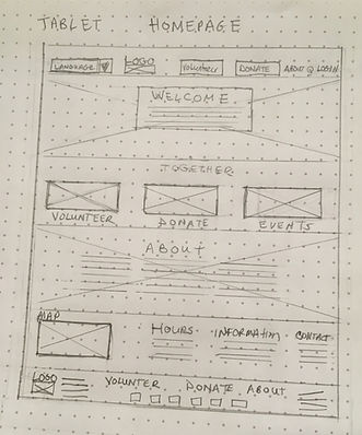
Tablet
Mobile
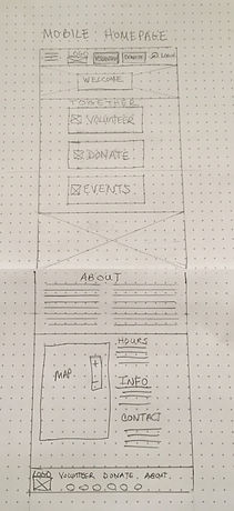
Stars were used to mark the elements on each sketch to mark the items that would be included on the initial digital wireframes.
Digital Wireframes
Users needs: Flexible scheduling that looks well into the future so they can coordinate busy schedules for group volunteering- I created choices for this month, next month plus further out. Volunteering impact statistics are front and center. A way to cancel or reschedule a job that does not make them feel bad about making those changes- I used large buttons and its not hidden so it is inviting to cancel or make changes. A way to find out what the job is so they are not apprehensive going in and not knowing what they are doing- I created a carousel with pictures to describe what they will be doing at each position.
Wireframes
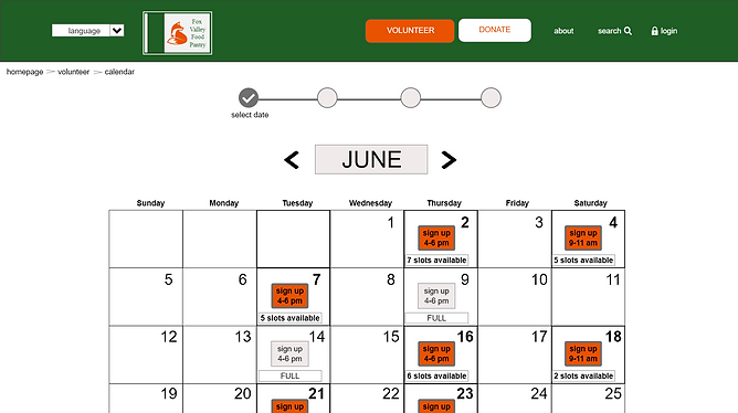
Busy schedule? Having several months worth of options really helps someone who wants to find a date that works for everyone in the volunteer group! Lots of dates sure makes it easy to sign up!
Need to reschedule or cancel your existing job? No problem! Large and visible buttons right on the front page make it easy and inviting to make changes. Now you don’t feel guilty for canceling that job and feel good about rescheduling a new one!
.png)
How is volunteering helpful to the community? This explanation gives the direct impact your volunteer work does. Wow, that makes you feel like the work you are doing is making a difference right in your own hometown!
Want to know what job you will be doing at the pantry? Just click through the carousel of job descriptions. Now you feel less apprehensive wondering what you will be asked to do.
Screen Size Variations
.png)
Calendar buttons are above the fold- Makes sign up easy at a glance!
Want to know what job you will be doing at the pantry? Job descriptions are easy to see using a carousel Just click through the carousel of job descriptions. Now you feel less apprehensive wondering what you will be asked to do.
.png)
Manage existing job session buttons are kept on the front of the volunteer page- don’t have to search around for it!
Usability Study Findings
I conducted two moderated usability studies each with 5 users. Both studies were remote and took about 20-30 minutes each. The first study was using a low fidelity prototype (view it here) on Adobe XD and had 8 questions pertaining to a primary user flow of signing up for a volunteer position. Findings from this study helped guide the design from wireframes to mockups. The second study was using a high fidelity prototype in Adobe XD and had 4 questions pertaining to the same user flow as the first study, the volunteer sign up process. This study revealed what aspects of the mockups needed revisions.
Study 1 Findings
1.Users need simpler phrasing that makes sense on the Group Sign Up page.
2.Users need a more intuitive way to search for forms or other information related to volunteering like job descriptions and canceling a job.
3. Users need the font of the calendar screen enlarged to meet WCAG standards.
4.User need a well defined option for choosing when they are going to volunteer.
5.Users need the logo to navigate them back to the home page.
Study 2 Findings
1. Users need an accessible color combination for the policies page that meets WCAG standards.
2. Users need a better way to see the “Already Signed Up” prompt.
3. Users need a more obvious or easier way to navigate the Group Sign Up page.
4. Users need a way to close the pop up pages.
5. Users need a way to understand the acronym FVFP.
Fox Valley Food Pantry Jam Board Usability Study I
In my research, I typed every single response and observation from the usability studies onto post-it notes. Using the Jam Board, I organized users pain points into themes. The themes became insights and then I prioritized the insights. These prioritized insights became the necessary improvements, based in quantitative research, to allow the product to flourish.
.png)
REFINING THE DESIGN
Mockups
Users needed a more intuitive way to search for forms or other information regarding volunteering including look up job descriptions and how to cancel a job. To fix this, I added a heading called “Volunteer Info” and one called “Donate Info” to the main header for every page on the website.They each feature an extensive drop down list when you hover over them. Since this was now part of the new header, users could easily find anything they wanted regarding volunteering and donation on these drop down lists that were now part of the header on every page. All of the user confusion as to where to go to cancel a job or look up job descriptions or print the waiver was cleared up. The new heading became an intuitive way to find items related to volunteering. I did not have a single person after the second usability study say they couldn’t find those items that most users originally struggled to find.
.png)
Before Usability Studies
.png)
After Usability Studies
Users needed a more intuitive way to navigate the Group Sign Up page. I originally had the “Confirm Reservation” button above the fold so it would be easier for users to see and find. However, this caused confusion. Users didn’t know if they should click confirm before they actually entered all of the names in the group. To fix this, I moved the confirm sequentially to the bottom so the natural thing would be to click that last. Users also were annoyed by all of the text above the names. To fix this, I re-worded it more simply and only referenced the word “Waiver” once. Users were unsure if “policies” and “waiver” in blue were links. To fix this, I also underlined them to make it more obvious you could click on them.
Before Usability Studies
.png)
After Usability Studies
.png)
Accessibility Considerations
1. All color combinations meet WCAG contrast ratio rating of good and above.
2. Icons and imagery are used in addition to text throughout the website and app in many places and on several pages to make navigation easier.
3. I used text with different sizes for clear visual hierarchy for users with assistive technologies.
4. The majority of the typography is sans serif with nothing smaller than 16pt. Typeface on the website and 12pt. On the mobile app.
5. I included a “language” selection on the top of the header as the first item.
6. All smart animation is equal to or less than 500ms for optimal accessibility.
7. I used landmarks to help users navigate the site.
Refined Designs
.png)
.png)
.png)
.png)
.png)
Screen Size Variations
I created the home page and the volunteer screen in a mobile size with an additional screen that fly’s out when you tap the hamburger icon. The calendar buttons are all there above the fold on both the tablet and the mobile so you can volunteer if you are at work, on the train or sipping a cup of coffee at the local coffee shop.
Desktop


Tablet
Desktop
.png)
mobile
.png)
.png)
High-Fidelity Prototype
The final high-fidelity prototype contains a new header on every page with a drop down list to allow anything having to do with volunteering more intuitive. It also meets users need by simplifying the group volunteer page which streamlines the overall sign up process in general. Finally, accessibility has been re-evaluated and revised based on user feedback.
View the Fox Valley Food Pantry website:
.png)
GOING FORWARD
Takeaways
Impact:
The website makes users feel unburdened and less anxious about signing up for a volunteer position which ultimately allows them to experience their main goal which is to feel like they are making a difference in their hometown.
“I love this website. It feels familiar, is super simple and quick- I felt like it literally took two minutes to sign up. The images and statistics shown makes me feel like I’d really be helping someone. Is this real? I’d like to donate now.” -D.S.
(quote from participant from usability study II)
What I learned:
While designing the Fox Valley Food Pantry, I learned that no matter how many times you think you are making something great, someone always has a different perspective and brings you back to reality. I learned how much I appreciate insightful feedback and how I learn so much from that. I also learned how much I have learned. I was so much more consistent in this design than my last one and all of the steps are feeling more and more familiar to me and I’ve gotten a lot better at asking questions.
Next Steps
1. Conduct an unmoderated usability study to see if our insights from the last study were on target and to understand users needs from a different view in a real world situation.
2. Narrow the participants in the next usability study to those who have different types of disabilities to make sure assistive technologies are working smoothly.
3. Go back and review and identify anything we missed and ideate on new features as needed.