Randi
Nasatir-Cleven
RC
Case Study:
Ray of Light
Dedicated Mobile App and Responsive Website Design
Want an easy and quick way to donate money or items to a person who is homeless as you walk by them? Or, maybe you want to educate yourself and dig deeper into the immediate needs of the homeless or donate on a monthly basis to get a person in need some semblance of stability. Either way, the Ray of Light dedicated mobile app and responsive website is a product that will meet your needs and allows you to shine a ray of hope onto our neighbors who are in need of permanent shelter and security.
PROJECT OVERVIEW
The Problem:
Users need a fast, easy and anonymous way to donate to people who are homeless when they see them on the street. It is too awkward and users feel unsafe approaching them directly plus they want to know where their money is being donated, i.e., not for drugs or alcohol. Users also need more education on the homeless and want other ways to donate and to show they care. Users want to help the homeless get a home.
The Goal:
Design a dedicated app and a responsive website that allows a quick, easy and anonymous way for users to donate to people who are homeless as they pass by them and/or to featured homeless who have immediate needs. Also to allow users to get more education on the homeless, dig deeper into their situations and allow users to actually give hope and ultimately help house a homeless person.
The Product:
Ray of Light has two main products: A dedicated mobile app that allows users, through bluetooth technology, to quickly, easily and anonymously donate on a one-time basis money or needs to a person who is homeless as they come within 25 yards of them. The second product is a responsive website that allows users to also donate to a person that they came near using the app but also lets them to do more in-depth research into the homeless, read their stories, donate to other homeless persons, donate to other homeless emergency campaigns and funds, sort through immediate needs and choose to donate monthly if they wish.
UNDERSTANDING THE USER
Personas and Problem Statements
.png)
.png)

.png)

My Role:
UX Designer designing a person in need of a home donation and education dedicated app and website from conception to delivery. Including UX research, product design, visual design and interaction design.
Project Duration:
December 2022 to February 2022
Responsibilities:
Conducting interviews, creating persona’s, conducting competitive audit, constructing paper and digital wireframing, building low and high-fidelity prototyping, designing responsive websites for multi-sized screens, conducting usability studies, analyzing affinity diagrams, composing actionable insights, accounting for accessibility, and iterating on designs.
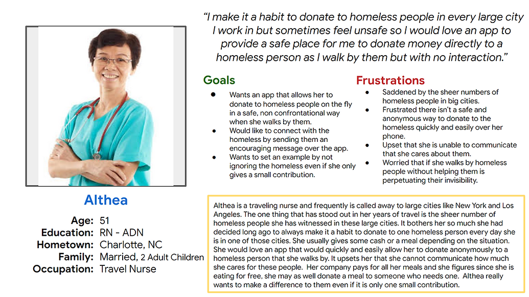
I conducted initial interviews and empathy maps to figure out who my user was and who might use the dedicated mobile app and who might use the responsive website. Most people in the survey said that they were saddened by the sheer number of people without homes they saw and they felt guilty ignoring them and they were frustrated that there was no easy way to donate money, food or items to the people in a safe or anonymous way. A second pain point was that they felt upset that they were uncomfortable trying to communicate to the homeless that they cared about them. They were worried that if they just ignored them, it would perpetuate the invisibility stigma already associated with the homeless. Another pain point was that they were worried about if they handed someone money, that it would just perpetuate the problem of alcohol and drugs and there was no way to be sure their money was being used in helpful manner. I came up with two distinct users, one who wants to just donate quickly as they walk by someone, and one who wants to dig a little deeper into the problem of people without stable shelter.
Althea is a traveling nurse who sees large amounts of homeless people in her travels who needs to use an app on her phone to quickly, easily and anonymously donate to a homeless person as she walks by them because she is too nervous and feels unsafe to approach them and physically hand them money or food but wants to help them and let them know that she cares.
.png)
Mario is a busy professional who sees a lot of the same homeless people every day on their walk to work who needs to use a website, later after work when they have time to research and eventually donate money or items to the specific homeless people they walk by every day because they don’t have time, are too nervous to stop and just give money or items and would like to know specifics about the homeless person if possible and also what their exact needs are.
.png)
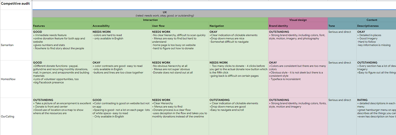
Competitive Audit
An audit of key competitor’s apps and websites by analyzing their strengths and weaknesses provided insights into gaps and opportunities for designing my own dedicated app and responsive website.
.png)
.png)
Ideation
I did a quick crazy 8’s exercise in addressing some of the gaps that I found in my competitive audit. Specifically, I focused on quickly and easily donating money or items anonymously to a person who is homeless as you walk by them.
.png)
STARTING THE DESIGN
Digital Wireframes
Users needs: A quick and easy way to donate is obvious with a large and obvious donate button as the first button. A listing of Immediate needs shows where this person is lacking and gives the user more control and makes them feel good when they know where the donation is going. A message button allows users to send a message of encouragement, hope and care - it allows users to show the person in need they are not invisible and that someone cares. A story button gives users a leg up on why persons in need are without housing creating empathy for users. The save button is great for users who are either hesitant or don’t have time to donate and want to look further into the donation later, at home, when they have time to do some research and read up on the person in need.
Listing of Immediate Needs so you can help the person in need where it counts most.
Want to quickly donate? Click the large donate button.
Want to know more about the person you are donating to? Read their back story here,
.png)
Want to send a message to the person in need? Click the message button and then you can show them you care.
Don’t feel like or have time at the moment to donate? Save the profile and go back later at home or the office, get on the website and look and donate then.
Usability Study Findings
I conducted two moderated usability studies each with 5 users. Both studies were remote. The first one was about 45 minutes and the second one was 20 minutes.. The first study was using a low fidelity prototype on Figma and had 9 questions pertaining to a primary user flow of donating to a Ray of Light Member. Findings from this study helped guide the design from wireframes to mockups. The second study was using a high fidelity prototype in Figma and had 4 questions pertaining to the same user flow as the first study, the donation process. This study revealed what aspects of the mockups needed revisions.
Study 1 Findings
1.Users need a more intuitive way to start the donation process.
2. Users need a better way to set up the permissions on the app.
3. Users need an easy and obvious way to donate multiple immediate needs.
4. Users need a clear indication on how to donate money or Immediate Needs.
5. Users need clearer and simpler wording on the radar screen.
6.Users need a clear and obvious way to donate to multiple Members.
Study 2 Findings
1. Users need a clear and obvious way to close the hamburger menu.
2. Users need a more intuitive way to enable or turn on the slide buttons.
3. Users need a simple description or explanation of how the app gets the items physically into the hands of the Members.
4. Users need a way to easily get a receipt after their donation.
5. Users need a more prominent representation of the radar image so they know the app is searching.
7. Users need a more intuitive way to send a message to a Member that makes sense.
8. Users need a more intuitive spot for the donation history section.
Ray of Light Jam Board Usability Study I
In my research, I typed every single response and observation from the usability studies onto post-it notes. Using the Jam Board, I organized users pain points into themes. The themes became insights and then I prioritized the insights. These prioritized insights became the necessary improvements, based in quantitative research, to allow the product to flourish.
.png)
REFINING THE DESIGN
Mockups
Users needed a more intuitive way to start the donation process. Most apps lose the login screen once you login the first time and the users I was focused on were ones that download the app and use it all the time, not newly created users. So, it made sense to make the main homepage, the search/radar page. I had this page, but it was the third page in the original process. So when a user is in an area with a lot of people who are homeless, they just tap the app and this homepage/radar page comes up and automatically starts searching for Members who have a bluetooth pendant. This page will tell you if your bluetooth is not turned on in the search tools enabled/disabled bar on the top. It will also then start popping up Members you can donate. There is a clear right arrow indicator where to click to get more information on the Member in need and start the donation process. The radar picture will “pulse” to indicate it is searching. This page also gives you a clear indication of where you are in the process of donating to a person in need. I put “who we are” and other info in the hamburger menu.
Users needed a more intuitive way to enable the permissions. Originally, I thought I would make a large, obvious permissions page but that just seemed to make things confusing. I created a streamlined permissions page that looks more like a settings in an app so it looks familiar to users. The new slider buttons are used in most settings and make sense to tap or slide the permission on and off rather than figure out which box to check in the original page. The green also makes it obvious it is on. I also explain to users they have to enable all three items to get the Ray of Light app to find a Member in need.
Before Usability Studies
.png)
After Usability Studies
.png)
Before Usability Studies
.png)
After Usability Studies
.png)
Accessibility Considerations
1. All color combinations meet WCAG contrast ratio rating of good and above.
4. Icons and imagery are used in addition to text throughout the website and app in many places and on several pages to make navigation easier.
2. I included a “language” selection on the top of the hamburger menu as the first item and on the homepage of the responsive website.
5. All smart animation is equal to or less than 500ms for optimal accessibility.
3. Icons and imagery are used in addition to text throughout the website and app in many places and on several pages to make navigation easier.
6. I used landmarks to help users navigate the site.
Refined Designs
.png)
.png)
.png)
.png)
.png)
High-Fidelity Prototype
The final high-fidelity prototype has a more intuitive way to start the donation process, a more logical and familiar way to enable the permissions and follows the same user donation process as the lo-fi prototype. It asks to donate money or items, the donation amount, the payment type, lists a review of your input and gives the user a confirmation page.
View the Hi-Fi Ray of Light Dedicated Mobile App:
.png)
RESPONSIVE DESIGN
Site Map
After designing the dedicated mobile app for Ray of Light, I moved on to designing a responsive website. I spent a long time on this site map - mapping from the app to the responsive web pages - I had to think out each menu item and what it needed it to do. This really helped to keep the product consistent and logical across devices.
.png)
Responsive Designs
The designs for screen size variation included mobile website, tablet and desktop. I refined my designs to fit the user needs for each of the screen sizes to provide the best user experience on each device.
Desktop
Tablet
Mobile
.png)
.png)
.png)
GOING FORWARD
Takeaways
Impact:
The website makes users feel like they can walk by a person who is homeless and donate to them anonymously and safely without the guilt of ignoring them or turning away or saying no. It makes users want to donate and feel like they can in a safe way and ultimately feel like they are setting an example, improving someone’s life and helping society as a whole.
“I really want to download this app and make a day of it…just walk around and see who pops up and then donate to each one - either a need or just give them cash- It would feel so good to go do that for a day instead of walking the other way to avoid them. Just think of everyone you’d impact!” -A.H.
(quote from participant from usability study II)
What I learned:
While designing the Ray of Light responsive website, I learned that I still have a long way to go with UX design. I had an idea that did not have a website to go off of, so I had to come up with a lot of the design on my own- which ended in 12 insights from the usability study. And that was just from one user flow. Luckily there is the usability study so I could greatly improve what I had done and completely re-do the homepage. The good new is, I really get most of the UX concepts and I love, love the process, each step just makes so much sense and builds upon the next. Whoever designed these steps really thought them out in detail and they just flow into each other nicely. I feel like I’ve really come a long way and I’m a better person for it. I understand people better and I understand what products should be doing better.
Next Steps
1. Conduct an unmoderated usability study to see if our insights from the last study were on target and to understand users needs from a different view in a real world situation.
2. Narrow the participants in the next usability study to those who have different types of disabilities to make sure assistive technologies are working smoothly.
3. Add some type of reward or incentive to users who donate or message our Members and offer more opportunities for them to help besides donations.