Randi
Nasatir-Cleven
RC
Case Study:
Smooth I-Do
Dedicated Mobile App Design
Want an easy way to keep track of everything you need to do on your wedding day? Smooth I-Do is a dedicated mobile app that listens to users needs to give them a one of a kind custom wedding ceremony checklist. The user flow that is highlighted in this app is creating the initial checklist.
PROJECT OVERVIEW
The Problem:
Newly engaged persons are overwhelmed, disorganized and worried about forgetting things when it comes to planning their wedding ceremony. They are also concerned about staying on budget and feel there is not enough detailed ceremony information out there.
The Goal:
Design an app that creates a detailed, customized and organized wedding ceremony checklist, based on the users own needs, listed in a manner that makes sense to them, ultimately allowing them to plan a seamless, unique and stress-free wedding.
The Product:
Smooth I-Do is a wedding ceremony checklist app for a venue in New Mexico. The app evaluates each users personal wedding data to create a one-of-a-kind customized wedding ceremony checklist. The app targets users who are newly engaged couples who want their ceremony well organized, want to feel less overwhelmed, and want their wedding to feel special and unique.
UNDERSTANDING THE USER
User Pain Points
1. Overwhelmed
Overwhelmed by lack of organization, costs, choices and too many tasks to complete.
2. Dissapointed
Disappointed there are limited ideas for same-sex ceremonies.
.png)
My Role:
UX Designer designing a wedding ceremony app for a venue in New Mexico from conception to delivery. Including UX research, product design, visual design and interaction design.
Project Duration:
April 2021 to November 2021
Responsibilities:
Conducting interviews, creating persona’s, conducting competitive audit, constructing paper and digital wireframing, building low and high-fidelity prototyping, conducting usability studies, analyzing affinity diagrams, composing actionable insights, accounting for accessibility, and iterating on designs.
3. Confused
Confused on what to include in their wedding ceremony.
4. Worried
Worried about staying on budget and worried about forgetting something.
.png)
I conducted initial interviews and empathy maps to understand the user better. From this research, over and over a similar theme kept repeating. The main user group I identified are engaged couples who are simply overwhelmed. They don't know where to start. There are too many tasks to complete and choices to make. They're overwhelmed with costs. decisions and disorganization.
Persona and Problem Statement
Isabella is a newly engaged bride-to-be who needs a wedding ceremony checklist because she wants to stay organized, not forget anything and plan a beautiful wedding ceremony.
.png)
User Journey Map
The user journey map revealed that users need lots of links, images, and alerts but most of all users need to be able to customize their task lists so that their list is meaningful to them.
.png)
STARTING THE DESIGN
Paper Wireframes
Paper wireframes for the homepage when the user enters the main process of creating their initial wedding ceremony checklist from scratch had a lot of possibilities. I tried to focus on two things, one is a large start here button so users would know what to click first and then easily continue with the initial checklist creation process, but I also wanted the homepage to be a place for just some lookups, FAQ's about the app and allow users to click around the app without creating a login and a checklist.


Starred areas in the pictures above showed what I thought was most useful and looked simple and the final results is the 6th drawing shown above.
Digital Wireframes
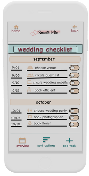
Users needs: a customized wedding ceremony checklist app. Sort the tasks in a way that is meaningful to the user. Generate an initial checklist based on custom information unique to the user. Add any new tasks, easily. Slide completed button when task is complete. Use sort options to easily change the way the list is sorted for example, by vendor(ex: Joe’s Florist), by urgency (what needs to be done asap), by length of time it takes (shortest tasks listed first), by theme (ex: food at the wedding), by person (Ex: groom’s tasks).
Users needs: allow for non-traditional wedding types and ceremonies so app is all inclusive and equitable. Each of the Ceremony Detail items has at least 12 items to select from to try to get the most customized as possible including underrepresented wedding ceremonies such as same-sex, not the first marriage, non-religious, military, outdoor, destination, virtual, etc.
Get organized and stay on track! Tasks based on individualized input data and listed by month and date. Lists helps you to not forget anything and feel less overwhelmed.
You are going to Joe’s Florist tomorrow and wish you knew all tasks pertaining to this. Just click “Sort Options” and choose “Sort by Vendor.” Now that list is meaningful to you!
.png)
Complete a task? Just slide the “Completed” button. Ahhh....that feels good to have accomplished something!
Need to add your own task? customize easily by adding a task. This list now has that unique task that makes your ceremony so special!
Select from a drop down list the religion that best describes you. The app will tell you those specific traditions. Not religious? Select “None” and the app will give you vow examples and links to non-religious clergy.
Getting married in Puerto Rico? Just click “Destination Wedding” here and the list will generate all your tasks for a fantastic time for all!
.png)
Your favorite aunt wants to give you a shower and you brother wants to make a toast at the wedding. Just click “Bridal Shower” and “Toasts” here. The app will list these items and give you all the information for each one including links, tips and examples.
Usability Study Findings
I conducted two moderated usability studies each with 5 users. The first study was using a low fidelity prototype on Figma (view it here) and had 8 questions pertaining to a primary user flow of creating the initial checklist. Findings from this study helped guide the design from wireframes to mockups. The second study was using a high fidelity prototype in Figma and had 5 questions pertaining to the same user flow as the first study, the initial checklist creation.
Study 1 Findings
1.Users need better cues for what steps are required to create an initial wedding ceremony checklist.
2. Users need an indicator to tell them where they are in the checklist creation process.
3. Users need a more intuitive way to go back and change existing wedding details after creating the initial checklist.
4. Users need simple, accessible and consistent language throughout the checklist creation process.
5. Users need a non-biased way to order a list of sensitive information.
Study 2 Findings
1. Users need better cues for what steps are required to create an initial wedding ceremony checklist.
2. Users need “FAQ” evaluated for accessibility because one user could not read it.
3. Users need a way to create an account where they feel confident that creating an account is an okay and necessary action to do in the app.
4. Users need an indicator to tell them if they have completed a section on the ceremony detail page.
5. Users need a more intuitive way to know if they are continuing or going back to the same page on the ceremony detail page.
Smooth I-Do Jam Board Usability Study I
In my research, I typed every single response and observation from the usability studies onto post-it notes. Using the Jam Board, I organized users pain points into themes. The themes became insights and then I prioritized the insights. These prioritized insights became the necessary improvements, based in quantitative research, to allow the product to flourish.
.png)
REFINING THE DESIGN
Mockups
The original homepage was too busy, had too many elements and it was unclear to users where to start the checklist process. The new design, after two usability studies, shows a clear start path to creating a customized ceremony wedding checklist. While it also provides other elements to explore even if you don’t want to create a checklist without the screen being too busy.
Before Usability Studies
.png)
After Usability Studies
.png)
Users needed a more intuitive way to know if they were continuing or going back to the same page when on the ceremony detail page. To fix this, I changed the words “click here to continue” on the drop down list to just “done” so they would not think they were continuing. They also needed an indicator to tell them if a section was completed. To fix this, I added a help section to tell them to complete all of the sections before continuing accompanied by asterisks, plus I changed the word from “select” to “completed” and also the color changed from black to dark aqua after they completed the section.
Before Usability Study 2
.png)
.png)
After Usability Study 2
.png)
.png)
Accessibility Considerations
1. All words are WCAG contrast ratio of at least 7:1 or large text at least 3:1.
4. Words and colors indicate when an action is complete.
2. Sans serif typography is used and nothing smaller than 12pt. typeface.
5. All smart animation is equal to or less than 500ms for optimal accessibility.
3. Icons and imagery is used in addition to text throughout the app in many places and on several pages to make navigation easier.
Refined Designs
.png)
.png)
.png)
.png)
.png)
High-Fidelity Prototype
The final hi-fidelity prototype contains better cues to make the start process clear. It also meets user needs by making the ceremony detail page more streamlined with a more innate flow. Finally, accessibility has been re-evaluated and revised based on user feedback.
.png)
GOING FORWARD
Takeaways
Impact:
The app makes users feel excited and happy about their upcoming wedding instead of overwhelmed and disorganized.
“I like the idea of this app and hope it gets created! I can’t wait to dig in and start tackling my custom checklist. I’m just getting started planning my wedding and this app would keep me organized and on task and even on budget- great idea!” - K.C.
(quote from participant from usability study II)
What I learned:
While designing the Smooth I-Do app, I learned that there are various ways to find out what users are looking for: from surveys, to usability studies, to affinity diagrams, to competitive audits, to peer feedback. I also learned that each user brings their own unique perspective and background which many of them opened my eyes to things I never thought of and even things I didn’t realize were occurring.
Next Steps
1. Conduct an unmoderated usability study to see if our insights from the last study were on target and to understand users needs from a different view in a real world situation.
2. Narrow the participants in the next usability study to those who are underrepresented in the wedding planning process to make sure the product is accessible for underrepresented users for example, same-sex marriage, destination weddings, etc.
3. Go back and rearrange the affinity diagram to see if there are any new pain points that come up and need more reviewing. This might give us a fresh perspective of things we missed.